by Charles Kemp
The United States Civil War check tax began with the Revenue Act of 1862. The use of imprinted revenue stamps began with the first American Phototype deliveries in 1865. Effective October 1, 1872, the tax on all documents was eliminated except for bank checks, drafts or orders for the payment of any sum of money whatsoever, drawn upon any bank, banker, or trust company and payable at sight or demand. Imprinted revenues continued to be used on many of these instruments until July 1, 1883, when all documentary taxes were abolished.
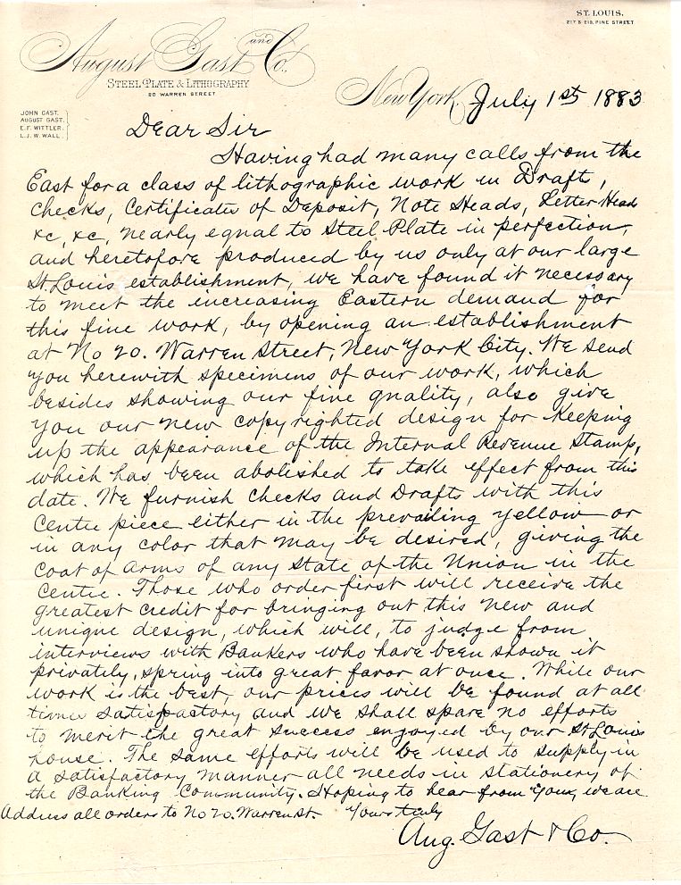
Apparently because of the length of time that the bank check tax was in effect, some printers saw opportunity in the elimination of this final documentary tax. In this letter by August Gast the company offers to provide customers with “our new copyrighted design for keeping up the appearance of the Internal Revenue Stamp”. The letter is dated July 1, 1883, the very day that the tax was abolished.
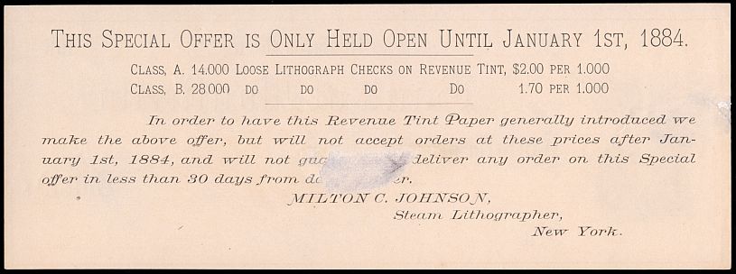
Milton C. Johnson hurried to get a share of this market. This advertisement is from the back of one of his sample checks. Considering that the offer was only good to January 1, 1884, it must have been offered months ahead of time, possibly even before the time when real imprints were no longer needed.
Nor were Gast and Johnson the only companies to see potential profits in providing customers with a design resembling the, by then, familiar imprinted revenue stamp. These facsimile stamps are known from a number of printers and, since most users were small local firms, there were undoubtedly many more that have not survived.
It would seem that people had grown so accustomed to seeing a stamp, either adhesive or imprinted, on a check or draft that it was felt that they might reject one that did not appear to have the stamp. There had been heavy penalties for failing to properly pay the tax and after almost twenty-one years of it, people needed reassurance.
Imprinted revenue stamps had been introduced as a convenience to eliminate the possibility of running out of the adhesive stamps or of theft. They had been printed at first in a variety of shapes, designs and even colors but the diamond-shaped type known as RN-G1 had become the only design available for the final eight years of the tax.
It is not by chance then that most facsimiles printed after July 1, 1883 are shaped like the Type G and in the orange color which was the only one used for that design. Often they are found in conjunction with a security background in the same color as the stamp. Since there is clear area visible in the stamp, the stamp and background were either integral to the same plate or, in some cases, the FAC was actually a removable slug in a two-piece plate.
There are also facsimiles printed for use before this date, which resemble the tax imprints then in use. These stamps were created in response to earlier changes in the Statues and are quite scarce.
The term that collectors use for these designs is RN-FACs. There are three generally accepted criteria for determining if a design is a FAC:
1) They must be dated for use in a period during which the instrument that they were printed on was not subject to tax.
2) The color must be a shade of orange as used by most actual stamps.
3) The shape should resemble that of an actual stamp.
Note that these criteria exclude designs of horses, elephants and cattle which appear on some checks in positions suggesting that they may have been used to fill the space once used by revenue imprints. Some collectors do include these as FACs. This article also does not cover modern FACs, those produced from the 1970’s up to the current time which generally imitate American Phototype designs. Since there has been no recent memory of actual tax imprints, these serve purely as decoration.
The firm of August Gast made a specialty of stamps with the seal of states and at least one territory. Other printers used whatever designs they felt might appeal to potential customers. Today these provide collectors with an interesting sideline to collecting the imprinted revenue stamps. Outside of a few well-known types, most are scarce and a challenge to the determined collector.
FACs Used During the Tax Period
Such early use of a facsimile is very rare but actually there was even more need for one in these cases as the instruments were being used at the same time as those required to have stamps. This would have made them even more suspect to people.
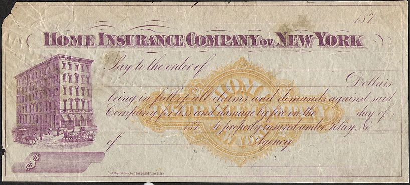
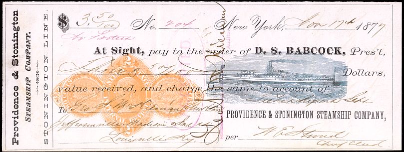
Figure 1) This check bears a facsimile shape resembling the RN Type C. Although unused, the check bears the printed date 187_ and so would appear to require an actual stamp and not a facsimile. The check, however, is on an insurance company and states that it was to be used to pay claims and damages from fire on premises insured by the company.
Effective October 1, 1872, all checks, drafts and orders drawn on any person, persons, companies or corporations other than those on a bank, banker or trust company had been exempted from the tax. Therefore, the Home Insurance Company of New York, not being a bank and the check being intended for signing by their treasurer or other authorized officer and not a banker, was not obliged to stamp this particular instrument. To quote the Gast letter again, the FAC was there for the purpose of “keeping up the appearance of the Internal Revenue stamp”.
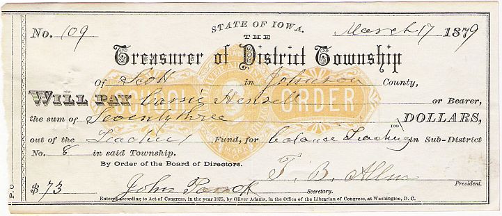
Figure 2) This 1879 warrant on the Treasurer of the District Township of Scott in Iowa bears a facsimile which resembles the RN Type D. In fact there is another known type from Nebraska, by the same printer, which has a design even closer to the Type D. Perhaps he had been advised to alter his original design so as not to infringe on a copyright.
The printer was Oliver Adams of Chicago and the design has a portrait in the center, which is assumed to be that of Mr. Adams. Around the portrait is “OLIVER ADAMS” and “PUBLISHER CHICAGO”. At the bottom of the check is the legend “Entered according to Act of Congress, in the year 1875, by Oliver Adams, in the Office of the Librarian of Congress, at Washington, D.C.”>
The apparent logic behind using a facsimile stamp on this instrument was the Act of July 13, 1866, which exempted any instrument drawn by a state, county or city official in their official capacity. This is therefore, another example of an instrument that was not subject to the tax having a facsimile stamp to assure people that it was legitimate.
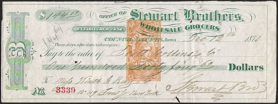
Figure 3) This 1873 draft bears a stamp resembling the RN Type E and has been condemned as an illegal attempt to evade the stamp tax law. Actually, the key here is the legend “Three days after date” that appears above the “Pay to” line. This makes it a draft payable at a designated time and the tax on such instruments had been eliminated by the Act of June 6, 1872, which became effective October 1, 1872.
This draft was also exempted from the tax and the facsimile was only an attempt by the Stewart Brothers to reassure their customers that this was a legitimate draft.
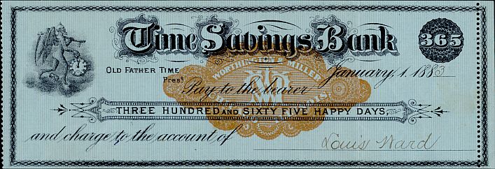
Figure 4) A most unusual use of a FAC during the tax period: on a greeting check. Of course, to make it appear “legal” it would need a facsimile tax stamp. This one looks like a combination of some of the American Phototype designs.
RN-FACs in non-revenue colors
Although one of the criteria I’ve adopted for determining if a design is a FAC or not is the color, there are several printed in colors other than orange which are still clearly intended to be FACs. One of these is questionable, however, as it is unused and may have been intended as a specimen or sample.
Figure 5) This generic draft was done by Argus Print of Fargo, Dakota Territory. It has a facsimile shaped like the familiar Type G with a design meant to resemble the territorial seal but printed in red, as is the border. It is dated 1887 and is obviously meant to be a FAC. The reason for printing it in red may simply have been a lack of orange ink at the time.
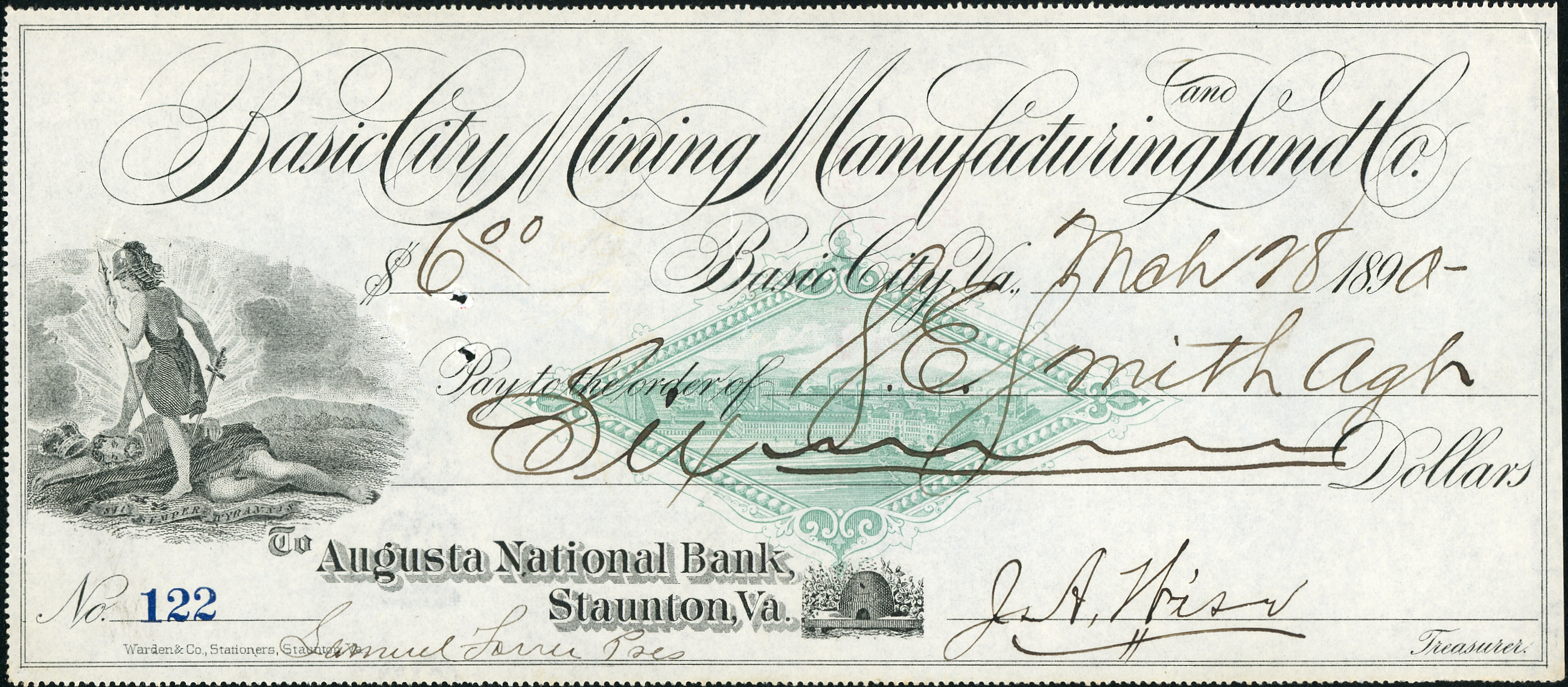
Figure 5A) Interestingly enough, the Basic City Mining, Manufacturing and Land Company used an identical orange design in the center of their letterheads, while choosing green for their checks.
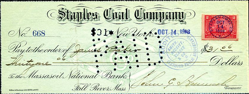
Figure 6) A check of the Staples Coal Company where the check and the FAC were printed at the same time, in the same color, green. If the FAC is going to be printed as part of the check design it is logical that the color chosen for the entire check would not be orange.
Also, however, referring again to the previously quoted letter from Gast, it advised “We furnish checks and drafts with this center piece either in the prevailing yellow or in any color that may be desired…”.
So, although considering how long the orange had been the prevalent color and that any other color might weaken the purpose of a FAC, at least one company was offering to print in any color that the customer might request. Despite that, these are the only non-orange FACs known at this time.
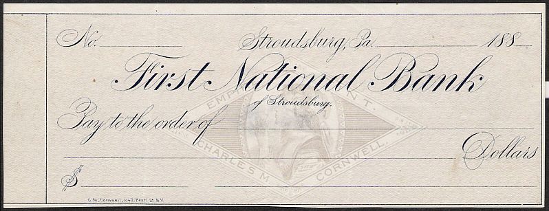
Figure 7) This is an unusual item. Printed by Charles M. Cornwell of New York City, the script is in a dark blue and both the safety background and what is obviously intended to be a FAC are in gray. Because this example was never used, the purpose is unclear. Besides Cornwell’s name, the stamp also has “EMPIRE TINT” on it. Does this mean that it was meant to be gray? Or is this a printer’s proof that was intended to have the FAC and background in orange when finalized? Maybe someday a used example will be found and we will know.
Catalog of RN-FACs
This is not intended to be a listing of all known instruments bearing FACs but is intended to be a listing of all known FACs by type. Anyone having FACs of types not listed here is encouraged to add them.
FACs are attributed to the printer whose imprint is found on the instrument but there is no guarantee that the printer so named is necessarily the printer of the FAC. They could have ordered paper with them already printed. After all, this is how the real stamps were spread about the entire country later in the tax imprint period. They could also have used the bank’s proprietary design. See the next Figure for an example of how this is possible.
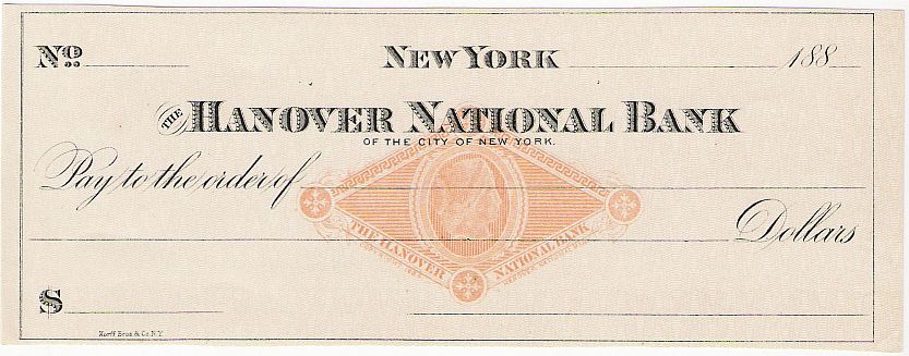
Figure 8) This is a common FAC, with a head of Liberty closely resembling the one on the RN-G1. The check itself has the imprint of Korff Brothers & Company of New York City. The FAC, however, bears the legend “COPYRIGHT 1884 HANOVER NATIONAL BANK” under the stamp. The bank would then have allowed any printer that the customer chose to use them or they could have provided these special checks themselves. In fact, a check is known where the Hanover Bank used this FAC on personalized checks for a particular customer, printer unknown.
It is possible that the FACs found on other instruments are also the property of the bank and not the printer. This is very likely to be the case for the listed ones with the bank’s initials as the central part of the design.
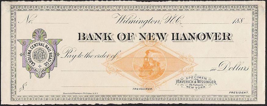
Figure 9) This specimen by Maverick & Wissinger is for the Carolina Central Railroad Company’s account at the Bank of New Hanover in Wilmington, N. C. Appropriately enough, it has a railroad vignette.
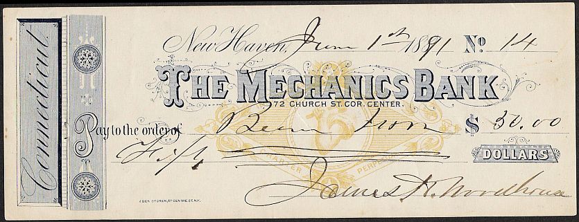
Figure 10) This FAC on a check of The Mechanics Bank also features an appropriate vignette with the strong arm of a mechanic. Along the sides is the legend “INCORPORATED 1824” and “CHARTER PERPETUAL”. Indicating that although the check bears the imprint of Eben Storer, 67 Centre St. N. Y., this too may have been the bank’s own RN-FAC.
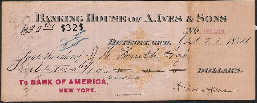
Figure 11) This draft from the Banking House of A. Ives & Son in Detroit carries the imprint of The Calvert Lith. Co., Detroit. The FAC has a head of Liberty but does not resemble the one of the Type G. It is printed on a safety paper with vertical lines.
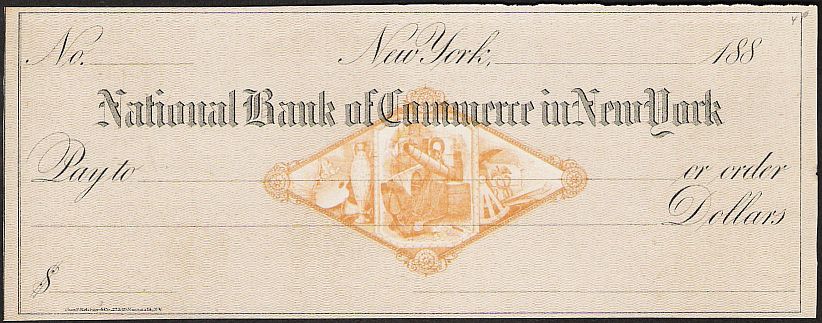
Figure 12) This check on the National Bank of Commerce in New York has an attractive FAC with an anchor, boxes of cargo and a ship’s sails in the center along with an artist’s palette and urn at left and a sextant and caduceus at right. The check was printed with a security background with wavy, horizontal lines background by Chas. F. Ketchum & Co., 27 & 30 Nassau St., N. Y. The FAC, however, may not be their product. See the next example.
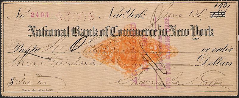
Figure 13) Another check on the National Bank of Commerce in New York with the same FAC peeking out from under a RN-X7, which has almost obliterated it. This example, however, has the imprint of Thomas Nolan, 28 Cedar St., N. Y. and with a different type of background. Possibly this is another indication that this FAC was the property of the bank and the plate for it was supplied to whomever was printing the check.
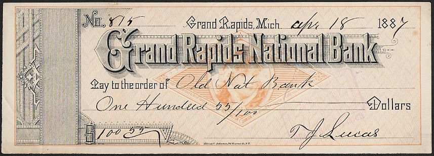
Figure 14) Milton C. Johnson is one of the most commonly found printers of FACs. He used a young girl’s head facing to the right as on this check on the Grand Rapids National Bank of Grand Rapids, Michigan. It is dated April 18, 1887 and bears a FAC with “REVENUE TINT” at top and “Entered according to Act of Congress in the year 1883 by MILTON C. JOHNSON in the Office of the Librarian of Congress at Washington” at the bottom. The background is a basket weave security type in the same color as the FAC. In addition the check bears the imprint of Milton C. Johnson, 70 Warren St., N. Y. So, in this case we could safely assume that the same company did both the check and the FAC.
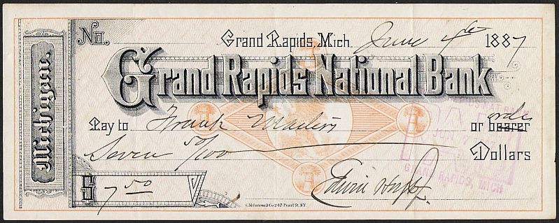
Figure 15) This is another check from the Grand Rapids National Bank which closely resembles the Johnson product in Fig. 14 and is dated within a few months of it. This FAC, however, has an eagle on a rock and haystacks at the points of the diamond shape. The check was printed by C. M. Cornwell Co., 247 Pearl St., N. Y.
Cornwell also printed the check shown in Fig. 7 but with a different design for the security background and the FAC. In this case the security background is similar to the Johnson check. Not only that but the unusual style of lettering used in the upper part of the checks is exactly the same. Only in the left panels and from the “Pay to” line down is there any difference and then only in the wording and the size of the device for the numerical amount. (The Cornwell check illustrated also has “Michigan” running up the left side, unlike the Johnson version. Cornwell also printed a check without “Michigan” at the side, which looks even more like the Johnson version. – Editor)
This suggests that Johnson and Cornwell supplied only the paper with their FACs and safety background. Then a local printer could print the balance of the check using his own plate. Two different customers used these checks and if a local printer were used, he could have shown them samples of both Johnson’s and Cornwell’s FAC to them and let them choose. This is a convenient theory but unfortunately, the next example eliminates the possibility of a local printer.
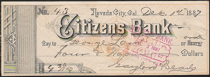
Figure 16) This is a check from the Citizens Bank of Nevada City, California. With the exception of the large letters with the bank’s title, it resembles the example in Fig. 14 almost exactly. Although Johnson’s imprint is not on the check itself, his copyright statement is on the FAC and the matching type on a California check indicates that he must have printed it. So, the question remains of how did Johnson and Cornwell both come to have this very unusual type?
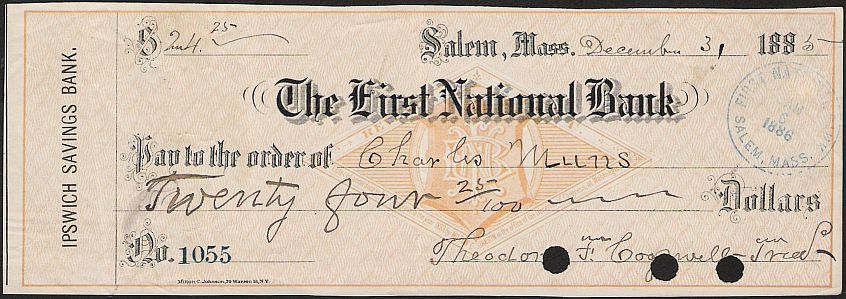
Figure 17) This check on The First National Bank of Salem, Massachusetts has the bank’s initials in a monogram, but is printed by Milton C. Johnson. The stamp bears the same legend as Fig. 14 above and the same security background. The FAC is the same size as the one in Fig. 14 (2” x 311/16”) which suggests that Johnson might have used a two-piece plate. The design has straight edges that would permit an interchangeable centerpiece. The FACs with ornate designs overlapping the edges would not have this ability.
Figure 17a) Another variation on the Johnson FAC. This one has initials of the Second National Bank in the center. This strengthens the idea that Johnson used a two-piece plate to allow different initials for different banks without reworking the entire design.
More on the Milton C. Johnson FACs here.
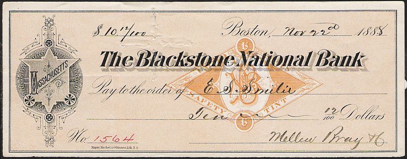
Figure 18) This check from The Blackstone National Bank of Boston has a FAC with the bank’s initials in a monogram inside it. The FAC also has “UNITED STATES” at the top and “SAFETY TINT” at the bottom. The safety background is the usual orange and composed of straight lines running at opposing angles.
Figure 19) Another version of a diamond-shaped FAC with bank initials inside. There is no indication of the printer.
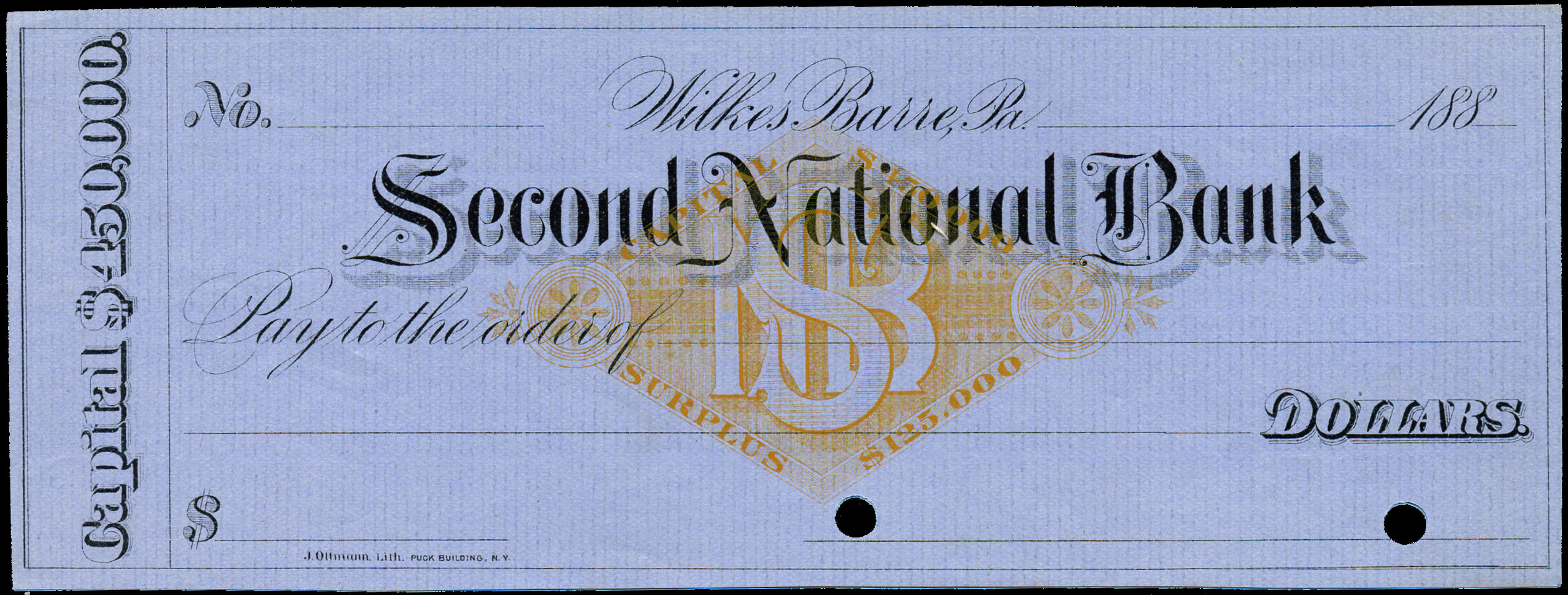
Figure 20) This check with a bank FAC was printed by J. Ottmann of New York. The punched holes in the signature line indicate that it probably was a specimen kept by the bank or a remainder.
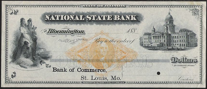
Figure 21) The Western Bank Note Company of Chicago printed this draft for the National State Bank of Bloomington, Illinois. This is a handsome FAC as befits a product of a major engraving company. Washington is in the center of the ornate frame and since there is a hole punched in the line for the cashier’s signature, it may be a proof draft.
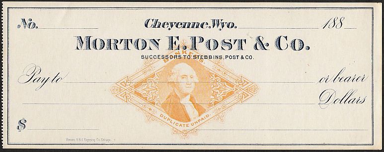
Figure 22) Another check by WBN Co. for Morton E. Post & Company of Cheyenne, Wyoming. This has a FAC similar to Fig. 21 but has “BANKERS” added at the top and “DUPLICATE UNPAID” below. Here is more on the Post FACS.
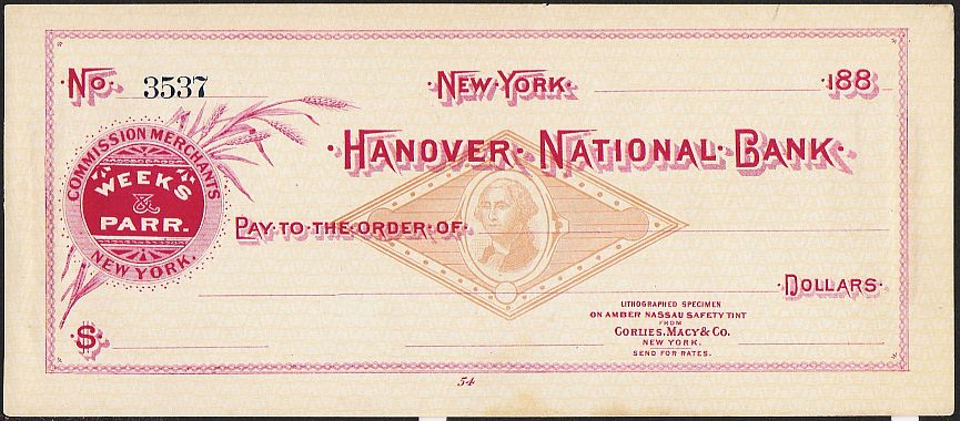
Figure 23) Another head of Washington in a simpler frame is on this specimen from Corlies, Macy & Company of New York. This firm was a proliferate printer of checks and many examples are known from their presses. This one has “LITHOGRAPHED SPECIMEN ON AMBER NASSAU SAFETY TINT PAPER FROM Corlies, Macy & Co., NEW YORK” printed along with an invitation to “SEND FOR RATES”.
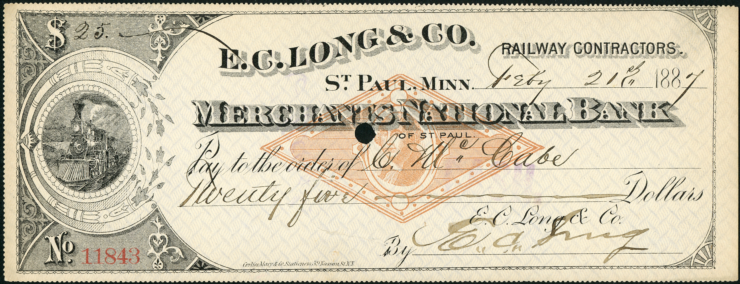
Figure 24) A used copy of a Corlies, Macy check bearing the FAC design shown on the sample in Figure 23.
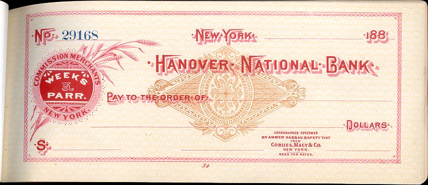
Figure 25) Corlies, Macy advertised another FAC at the same time as the one with the head of Washington. This example is still in a complete book of specimens. Are there used examples?
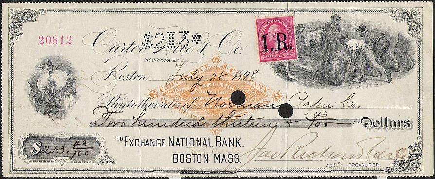
Figure 26) This check printed by the Brooks Bank Note Company of Boston has what could be called an “AD-FAC”. It has “CARTER RICE & COMPANY” at top and “CORPORATION BOSTON, MASS.” at the bottom. Inside it reads “ESTABLISHED JANY 1, 1871” and “INCORPORATED JULY 8, 1863” (Apparently, someone mixed these dates up). This check was used for such a long time that it ran into the era of the Spanish-American tax and had to have an adhesive stamp added.
Figure 26a) This FAC is an unusual shape, but it falls in the period when FACs would have been appreciated, two years after the end of the tax on checks. It doesn’t have a state seal as part of the design, but it says “State of New York” in the border around the logo of the First National Bank, so it’s a good lead-in to the next section of the Primer.
State Seal FACs
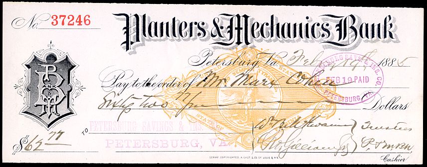
August Gast of St. Louis made a specialty of printing FACs with state seals. There is a special section on the ASCC website devoted to these. One example on a Virginia draft is shown above. Other companies also got into the act either of their own volition or in imitation of Gast.
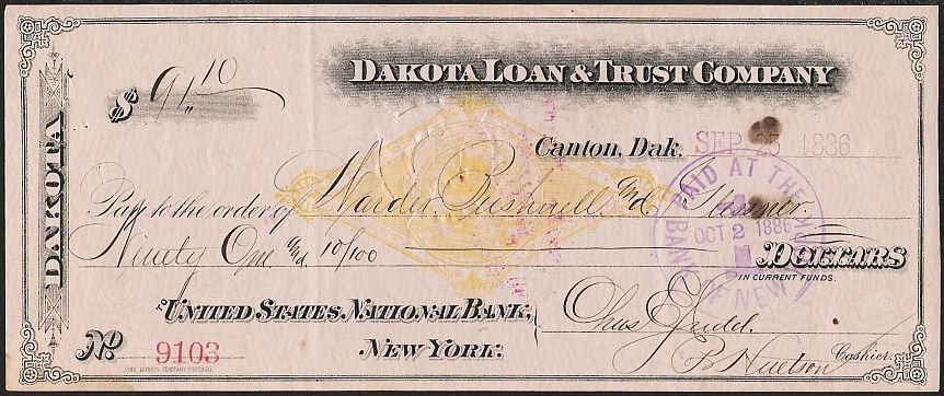
Figure 28) This draft on the Dakota Loan & Trust Company of Canton, Dakota Territory has a seal based on the territorial seal but differing considerably from the one produced by Gast. At the top and bottom is the same wording “UNITED STATES” and “DAKOTA TERRITORY” but above the tree and stars in the seal is the motto “LIBERTY AND UNION, ONE AND INSEPARABLE, NOW AND FOREVER”. It has the imprint of the John Morris Company, Chicago. (See the writeup of Gast’s Dakota FACs at the link above for more comments on this FAC.)
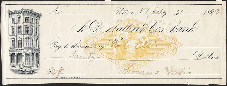
Figure 29) This check on A. D. Mather & Co.’s Bank in Utica, New York has a FAC that resembles Gast’s but the seal is enclosed in a single circle that touches the inner diamond shape. Gast’s seals are in a double circle that does not touch the diamond shape. There are also minute differences in some of the decorative devices and perhaps, most importantly, all of Gast’s products have his imprint. This one has the imprint of J. H. Warner, 81 John St., N. Y.
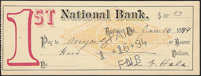
Figure 30) This rather unusual check on the First National Bank of Beatrice, Nebraska has a FAC that differs considerably from Gast’s and underneath it in small letters is the imprint “STATE JOURNAL CO., LINCOLN, NEB. The imprint is in the same color as the FAC and so we can assume that the State Journal is the printer of both check and FAC.
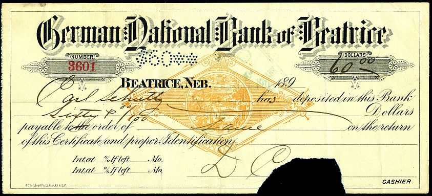
Figure 31) A different sort of state seal FAC used in Beatrice, this time on a certificate of deposit from the German National Bank. The printer was J.C. Hall.
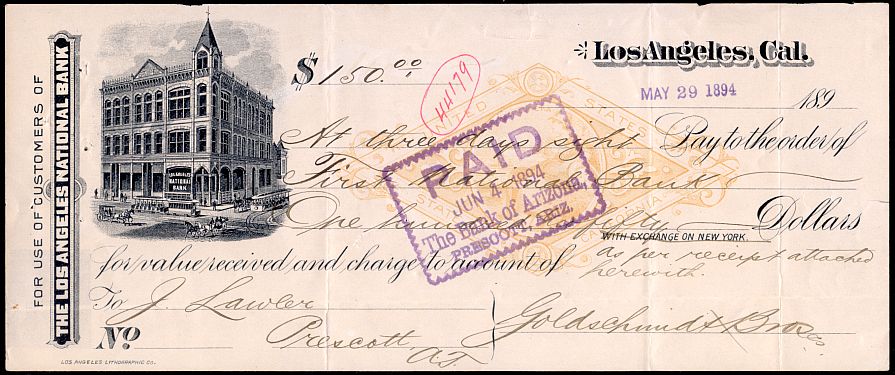
Figure 32) A time draft from Los Angeles with a Gast-type FAC, but different from theirs and any others shown above. It was presumably the production of the Los Angeles Lithographic Company, who printed the instrument.
Figure 32a) The FAC on this check is somewhat like the one on the check in Figure 32 above, but there are enough differences to indicate it is from a different supplier. Since there is no printer indicated on the check itself, we have no idea who that might have been.
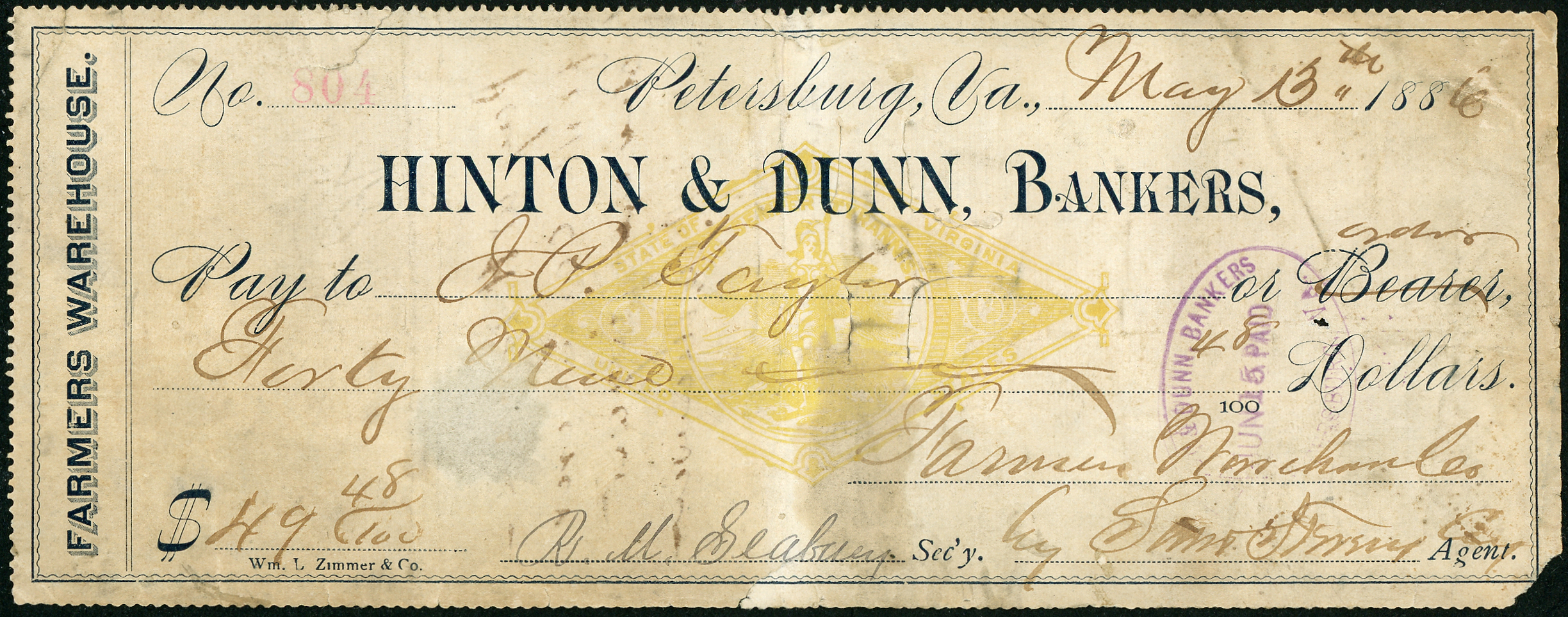
Figure 32b) This bedraggled check has a different Virginia state seal FAC. The check was printed by Wm. L Zimmer & Co., who may have supplied the FAC for its customers as well.
Business School Checks
Business schools operating either on their own or as part of a college became widespread in the second half of the Nineteenth Century. These schools endeavored to train their students in all fields of business practice. To do so, they printed teaching aids including not only school scrip, intended to look like currency but also checks, drafts and even facsimile adhesive revenue stamps to go on them.
A few examples of college checks are found with FACs.
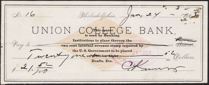
Figure 33) This practice check from the Union College Bank has what could be called an Instructional FAC. It explains its purpose by stating “This space is used by Banking Institutions to place thereon the two-cent internal revenue stamp required by the U. S. Government to be placed on Checks, Sight Drafts, Etc.” The shape and color of the FAC resemble that of RN-G.
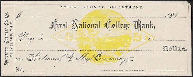
Figure 34) Another practice check from the Spencerian Business College of Cleveland, Ohio. The check also has “First National College Bank” at the center and is payable in “National College Currency”. The shape of the FAC is a bit doubtful but it does have a “2” at each end and is the proper color.
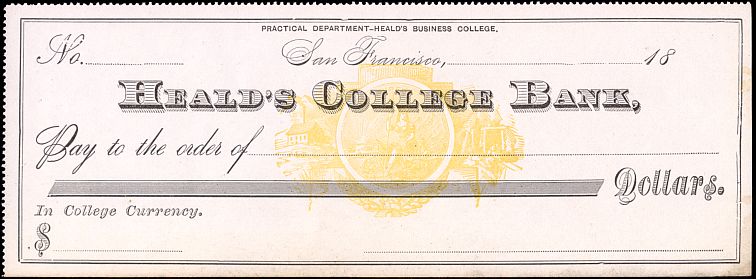
Figure 35) A check payable in College Currency from Heald’s College Bank, San Francisco. The FAC is even less credible than that on the Spencerian Business College check above, but again is in the correct color and was intended for use in the correct period.

Figure 35a) A totally un-FAC looking FAC. The main reason to include it is that it does say “Two Cents” in the design, so would have served its purpose. After all, inclusion on a college check would have been for instruction, not aesthetic value.
FACs used with Spanish American War imprints
A few FACs were used for such a period of time that they lapped over into the time of the Spanish American War tax and had to have real revenue stamps added.
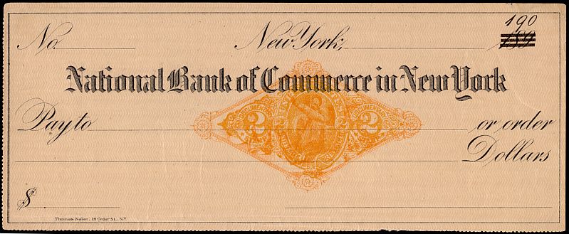
Figure 36) An unused copy of the check in Figure 13 where the FAC is virtually obliterated by the RN-X7 printed over it.
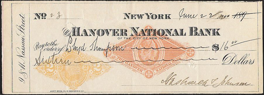
Figure 37) This check on the Hanover National Bank is similar to Fig. 6 but has a RN-X7 printed to the left. All considered, this was a certainly a better choice than Figure 36 above.
Also note Figures 6 and 26. These checks each have an adhesive stamp added. Figure 6 has an R164, battleship design, while Figure 26 has R155, an overprinted two-cent postage stamp.
Late use of FACs
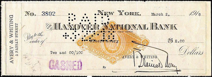
Figure 38) The FAC shown in Fig. 8 with the 1884 copyright, but dated March 2, 1918! The users, Avery & Whiting must have ordered a lifetime supply of these.
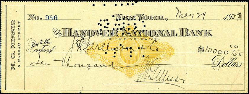
Figure 39) This FAC may take the prize for latest use. It is a different check using the Hanover National Bank FAC, used in 1927. The address of the user is on Nassau Street, as is that for Avery & Whiting. Stamp dealers?
Thanks to Georgette Cornio and Bob Hohertz for supplying some of the illustrations. Once again, anyone wishing to add to this listing is welcome to do so.
Note: Additional images were submitted in July 2010 and later. They are found in the appropriate sections of the original article above, with Figure Numbers with an “a”, as they were not in the original article.